This theme supports 2 template layouts full (wide ) and boxed. Just use the theme that best suits your needs.
The grid is built around two key elements: rows and columns. Rows create a max-width and contain the columns; columns create the actual structure. For layouts to work properly, always put your page content inside a row and a column.
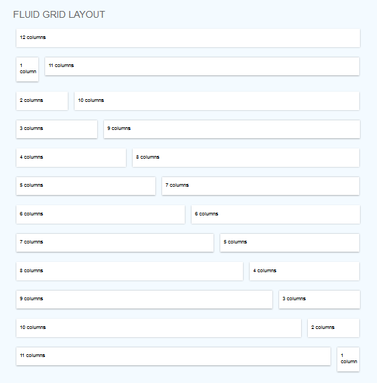
What you need to know is that columns don't have a fixed width. They can vary based on the resolution of the screen, or the size of the window.
Each column block is sized based on how many of the 12 columns it takes up. Example of main content + sidebar layout:
		Main content here


		Sidebar here
c8 means eight columns, c4 means four columns and so on. Choose as many combinations as you like as long as the total is 12.
Our document "columns.html" shows example of some columns variations.
Tip: to add some space on top or at the bottom of rows, use the class : "space-top" or "space-bot". You will notice it very used in our theme, too.
CSS Files and Structure
I'm using three main CSS files in this theme.
style.css - main css files (included reset styles);
skinblue.css - the skin for this theme.
In order to change the color skin, replace skinblue.css in all of our html documents (on top) with the skin color of your choice (you can get their names from CSS folder).
Quick example,let's say I choose the green skin. Then I'll replace:
with
responsive.css - stylesheet for responsive layout.
Optional stylesheets:
slider.css -used on every page that displays the slider icons.css -used for font awesome icons prettyPhoto.css -used for gallery
JavaScript
This theme uses several Javascript files, treated separately in our documentation according to the function they're serving.
An example of flexslider can be found in singleproject.html.
Uses stylesheet: slider.css
Uses Javascript files: jquery.flexslider-min.js
Carousel
In our theme the carousel plugin is used in home page, for showcase items, in "about.html" for logos, in "team.html" for team boxes carousel etc, but you may use it of course in any way you like.
STEP A. Notice "cat1", "cat2", "cat3" from lines 10,11,12. These are categories. Replace them with your own and add some more if needed.
STEP B. Assign category to each item, notice line 23, "cat2". In our example, "cat2" is the category assigned.
STEP C. Line 27, replace images/yourimage.jpg with your own image path.
STEP D. Line 29 & 39, replace singleproject.html with the path (link) to your detailed project.
STEP E. Line 29, notice mosaic-backdrop blue. Replace "blue" with the background color you want on hover. Available colors: orange, green, orangered, purple, black, gold, red, teal, tealdark, aqua, brown, lila, yellow.
The same steps apply to 3 columns portfolio, 4 columns portfolio and 5 columns portfolio as well (except the lines are different because of a different html structure)
Pay attention to image and thumbs path locations, in my themes I have used placeholders.
Masonry
Item elements are arranged intelligently within a vertical grid. For each item element, the script calculates the next best fit for the item within the grid.
You can find this style in Gallery (for images example) and Tesimonials (for text examples).
Wrap the boxes within
For a four-column alignment, an item will have this structure:
Text here
So, the final masonry layout will be:
Item 1 text


Item 2 text


Item 3 text


Item 4 text


Item 5 text etc
What about three or five columns? Use "boxthreecolumns" or "boxfivecolumns" instead of "boxfourcolumns".
That's it, you have a masonry layout. Don't forget the scripts at the bottom of the document ( you can find them in testimonials.html or masonry portfolio files).
Contact Forms
The contact form appears in contact.html..
Just find the following line in contact.php file (23 if you're using Notepad++ editor) and replace the existing e-mail address with your own.
Mauris placerat eleifend leo. Quisque sit amet est et sapien ullamcorper pharetra.
Accordion Example
		Quisque at erat vitae
		Lorem ipsum dolor sit amet, consectetur adipiscing elit. Donec auctor, lorem et consectetur ultricies, nulla lacus iaculis odio, in laoreet lacus nisi vitae dolor. In commodo aliquet orci.
		Sed euismod massa
		Mauris bibendum justo sit amet lectus laoreet faucibus. Aliquam cursus, diam sed lacinia ultrices, urna ipsum auctor lacus, id vulputate ante ligula aliquam odio. Fusce feugiat risus at nisl.
		Proin et orci sit amet
		Sed vitae magna. Aliquam faucibus, felis ullamcorper feugiat semper, tortor leo tincidunt nibh, a faucibus lorem magna a nisi. Pellentesque habitant morbi tristique senectus et netus et.
Toggle Example
Lorem ipsum dolor sit amet, consectetuer
Lorem ipsum dolor sit amet. Integer tincidunt.
Brem ipsum dolor sit amet, consectetuer
Borem ipsum dolor sit amet. Integer tincidunt.
Buttons Example
Boxes
Porem ipsum dolor sit amet, consectetuerorem ipsum dolor sit amet, consectetuer.


	 Responsive Theme

		DELIVERY

			 Lorem ipsum dolor sit amet, consectetur adipiscing elit. Aliquam hendrerit lacus mattis orci fermentum mollis iaculis purus lobortis. In et purus ut nunc elementum dapibus facilisis in quam.


	 Responsive Theme

		DELIVERY

			 Lorem ipsum dolor sit amet, consectetur adipiscing elit. Aliquam hendrerit lacus mattis orci fermentum mollis iaculis purus lobortis. In et purus ut nunc elementum dapibus facilisis in quam.


	 Responsive Theme

		DELIVERY

			 Lorem ipsum dolor sit amet, consectetur adipiscing elit. Aliquam hendrerit lacus mattis orci fermentum mollis iaculis purus lobortis. In et purus ut nunc elementum dapibus facilisis in quam.
Font Awesome Icons
This theme supports 249 icons thans to Font Awesome integrated in it.
How to use? Just add
and the icon will appear in your page. Replace "camera-retro" with the icon you wish to use. All icons showcase here: Font Awesome.
Sources and Credits
I've used the following images, icons or other files as listed. I do not own any credits for it.