版权所有 WowThemes.net 2015
此主题支持 2 种模板布局:全(宽)和盒装。只需使用最适合您需求的主题即可。
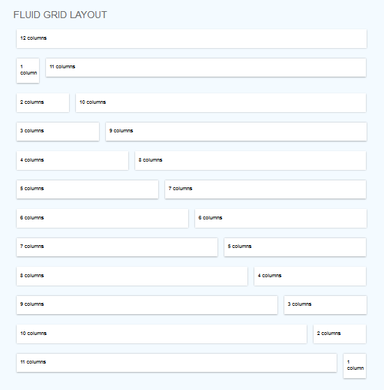
网格由两个关键元素构成:行和列。行创建最大宽度并包含列;列创建实际结构。为了使布局正常工作,请始终将页面内容放在行和列内。
您需要知道的是,列的宽度不是固定的。它们可以根据屏幕的分辨率或窗口的大小而变化。
每个列块的大小取决于它占据了 12 列中的多少列。主内容 + 侧边栏布局示例:
1 2 3 4 5 6 7 8 | <div class="row"> <div class="c8"><font></font> Main content here<font></font> </div> <div class="c4"><font></font> Sidebar here<font></font> </div> </div> |
c8 表示八列,c4 表示四列,以此类推。选择任意多的组合,只要总数为 12。
我们的文档“columns.html”展示了一些列变化的示例。
提示:若要在行顶部或底部添加一些空间,请使用类:“space-top”或“space-bot”。您会注意到它在我们的主题中也非常常用。
我在这个主题中使用了三个主要 CSS 文件。
为了改变皮肤颜色,请将所有 html 文档(顶部)中的skinblue.css替换为您选择的皮肤颜色(您可以从 CSS 文件夹中获取它们的名称)。
简单举个例子,假设我选择绿色皮肤。然后我将替换:
1 | <link rel="stylesheet" href="stylesheets/skinblue.css"> |
1 | <link rel="stylesheet" href="stylesheets/skingreen.css"> |
可选样式表:
slider.css - 用于显示滑块的每个页面
该主题使用了多个 Javascript 文件,在我们的文档中根据它们所起的作用分别处理。
jquery.js (1.9)使用样式表:
slider.css
使用 Javascript 文件:
jquery.cslider.js
滑块包含多个幻灯片,每个幻灯片都有一个 h2 元素、一个段落、一个链接和一个带有图像的分区(默认大小:238x420):
1 2 3 4 5 6 7 8 9 10 11 12 十三 14 15 16 17 18 19 20 21 22 23 | <div id="da-slider" class="da-slider"><font></font> <font></font> <div class="da-slide"> <h2>Some headline</h2> <p>Some description</p> <a href="#" class="da-link" style="width:202px;">Read more</a> <div class="da-img"> <img src="images/1.png" alt="image01"> </div> </div><font></font> <font></font> <div class="da-slide"> <!-- ... --> </div><font></font> <font></font> <!-- ... --><font></font> <font></font> <nav class="da-arrows"> <span class="da-arrows-prev"></span> <span class="da-arrows-next"></span> </nav><font></font> <font></font></div> |
An example of flexslider can be found in singleproject.html.
Uses stylesheet:
slider.css
Uses Javascript files:
jquery.flexslider-min.js
1 2 3 4 5 6 7 8 9 10 11 12 十三 | <div class="flexslider"><ul class="slides"> <li> <img src="images/yourimage.jpg" alt=""> </li> <li> <img src="images/yourimage.jpg" alt=""> </li> <li> <img src="images/yourimage.jpg" alt=""> </li></ul></div> |
In our theme the carousel plugin is used in home page, for showcase items, in "about.html" for logos, in "team.html" for team boxes carousel etc, but you may use it of course in any way you like.
Javascript used:
jquery.carouFredSel-6.0.5-packed.js
Script called with the following code:
1 2 3 4 5 6 7 8 9 10 11 12 十三 14 15 16 17 18 19 20 21 22 23 24 二十五 二十六 二十七 二十八 | $(window).load(function(){ <font></font> $('#recent-projects').carouFredSel({<font></font> responsive: true,<font></font> width: '100%',<font></font> auto: true,<font></font> circular : true,<font></font> infinite : false,<font></font> prev : {<font></font> button : "#car_prev",<font></font> key : "left",<font></font> },<font></font> next : {<font></font> button : "#car_next",<font></font> key : "right",<font></font> },<font></font> swipe: {<font></font> onMouse: true,<font></font> onTouch: true<font></font> },<font></font> scroll : 2000,<font></font> items: {<font></font> visible: {<font></font> min: 4,<font></font> max: 4<font></font> }<font></font> }<font></font> });<font></font>}); <font></font> |
Change 4 from min:4 and max:4 (line 23 & 24) to the number of items you want visible
To add a carousel in your page, follow the structure:
1 2 3 4 5 6 7 8 9 10 11 12 十三 14 15 16 17 18 19 20 21 22 23 24 二十五 二十六 二十七 二十八 二十九 三十 31 三十二 33 三十四 三十五 三十六 三十七 三十八 三十九 40 41 | <div class="row space-top"> <div class="c12 space-top"> <h1 class="maintitle "> <span>Carouse Title ( ex: recent work)</span> </h1> </div> </div><div class="row space-bot"> <div class="c12"> <div class="list_carousel"> <div class="carousel_nav"> <a class="prev" id="car_prev" href="#"><span>prev</span></a> <a class="next" id="car_next" href="#"><span>next</span></a> </div> <div class="clearfix"> </div> <ul id="recent-projects"><font></font> <font></font> <!--featured-projects 1--> <li> <div class="featured-projects"> <div class="featured-projects-image"> <a href="#"><img src="images/yourimagehere.jpg" class="imgOpa" alt=""></a> </div> <div class="featured-projects-content"> <h1><a href="#">Dolor sit amet</a></h1> <p><font></font> porta acean pulvinar<font></font> </p> </div> </div> </li><font></font> <font></font> <!--featured-projects 2--><font></font> <font></font> <!--featured-projects 3 etc--> </ul> <div class="clearfix"></div> </div> </div></div> |
To add a new item in carousel:
1 2 3 4 5 6 7 8 9 10 11 12 十三 | <li><div class="featured-projects"> <div class="featured-projects-image"> <a href="#"><img src="images/yourimagehere.jpg" class="imgOpa" alt=""></a> </div> <div class="featured-projects-content"> <h1><a href="#">Sit amet</a></h1> <p><font></font> porta acean pulvinar<font></font> </p> </div></div></li> |
In our theme, the text rotator is used in testimonials, but feel free to use it in any other context.
Javascript: jquery.cycle.js (make sure it is called if you are using it outside these pages).
To add a text rotator, follow the structure:
1 2 3 4 5 6 7 8 9 10 11 12 十三 14 15 | <div id="testimonials"><!-- text 1--><div> <div class="testimonial"><font></font> Text here<font></font> </div> </div><!-- text 2--><div> <div class="testimonial"><font></font> Text here<font></font> </div> </div><!-- text 3 etc--></div> |
Javascripts:
jquery.isotope.min.js for filterable portofolioWe will take as example the 2 COLUMNS PORTOFOLIO STRUCTURE: (see explanation after code)
1 2 3 4 5 6 7 8 9 10 11 12 十三 14 15 16 17 18 19 20 21 22 23 24 二十五 二十六 二十七 二十八 二十九 三十 31 三十二 33 三十四 三十五 三十六 三十七 三十八 三十九 40 41 四十二 43 四十四 四十五 四十六 四十七 四十八 49 50 | <!-- begin categories --><div class="row space-bot"> <div class="c12"> <h1 class="maintitle space-top"> <span>EXPLORE OUR WORK</span> </h1> <div id="nav"> <ul class="option-set"> <li><a href="" data-filter="*" class="selected">Show All</a></li> <li><a href="" data-filter=".cat1">Business</a></li> <li><a href="" data-filter=".cat2">Light</a></li> <li><a href="" data-filter=".cat3">Modern</a></li> </ul> </div> </div></div><!-- end categories --><font></font><font></font><font></font><div class="row space-top"> <div id="content"><font></font> <font></font> <!-- box 1 --> <div class="boxtwocolumns cat2"> <div class="boxcontainer boxcontainer2col"> <div class="mosaic-block cover mosaicover2col"> <div class="mosaic-overlay"> <img src="images/yourimage.jpg" alt=""> </div> <a href="singleproject.html" target="_blank" class="mosaic-backdrop blue"> <div class="details"> <b><br><br>Innovative Art & Dalya brings you Quality Furniture</b> <p><font></font> via Salique<font></font> </p> <i class="icon-link mosaiclink"></i> </div> </a> </div> <h1><a href="singleproject.html">Dalya Cream</a></h1> <p><font></font> porta acean pulvinar<font></font> </p> </div> </div><font></font> <font></font> <!-- box 2 --> <!-- box 3 etc --> </div></div> |
STEP A.
Notice "cat1", "cat2", "cat3" from lines 10,11,12. These are categories. Replace them with your own and add some more if needed.
STEP B.
Assign category to each item, notice line 23, "cat2". In our example, "cat2" is the category assigned.
STEP C.
Line 27, replace images/yourimage.jpg with your own image path.
STEP D.
Line 29 & 39, replace singleproject.html with the path (link) to your detailed project.
STEP E.
Line 29, notice mosaic-backdrop blue. Replace "blue" with the background color you want on hover. Available colors: orange, green, orangered, purple, black, gold, red, teal, tealdark, aqua, brown, lila, yellow.
Pay attention to image and thumbs path locations, in my themes I have used placeholders.
Item elements are arranged intelligently within a vertical grid. For each item element, the script calculates the next best fit for the item within the grid.
You can find this style in Gallery (for images example) and Tesimonials (for text examples).
Wrap the boxes within1 2 3 | <div id="content"><!-- items here --></div> |
For a four-column alignment, an item will have this structure:
1 2 3 | <div class="boxfourcolumns"><font></font>Text here<font></font></div> |
So, the final masonry layout will be:
1 2 3 4 5 6 7 8 9 10 11 12 十三 14 15 16 17 18 19 20 21 22 23 | <div id="content"><font></font><font></font><div class="boxfourcolumns"><font></font>Item 1 text <font></font></div><font></font><font></font><div class="boxfourcolumns"><font></font>Item 2 text<font></font></div><font></font><font></font><div class="boxfourcolumns"><font></font>Item 3 text<font></font></div><font></font><font></font><div class="boxfourcolumns"><font></font>Item 4 text<font></font></div><font></font><font></font><div class="boxfourcolumns"><font></font>Item 5 text etc<font></font></div><font></font><font></font></div> |
What about three or five columns? Use "boxthreecolumns" or "boxfivecolumns" instead of "boxfourcolumns".
That's it, you have a masonry layout. Don't forget the scripts at the bottom of the document ( you can find them in testimonials.html or masonry portfolio files).
1 | $to = 'wowthemesnet@gmail.com'; |
1 2 3 4 5 6 7 8 9 10 11 12 十三 | <ul id="tabs"><li><a href="#tab1">Highest Quality</a></li><li><a href="#tab2">Desk Support </a></li></ul><font></font><font></font><div class="container" id="tab1"><p>Donec eu libero sit amet quam egestas semper.</p></div><font></font><font></font><div class="container" id="tab2"><p>Mauris placerat eleifend leo. Quisque sit amet est et sapien ullamcorper pharetra.</p></div><font></font><font></font> |
1 2 3 4 5 6 7 8 9 10 | <div class="accordian"> <ul> <li>Quisque at erat vitae</li> <li>Lorem ipsum dolor sit amet, consectetur adipiscing elit. Donec auctor, lorem et consectetur ultricies, nulla lacus iaculis odio, in laoreet lacus nisi vitae dolor. In commodo aliquet orci. </li> <li>Sed euismod massa</li> <li>Mauris bibendum justo sit amet lectus laoreet faucibus. Aliquam cursus, diam sed lacinia ultrices, urna ipsum auctor lacus, id vulputate ante ligula aliquam odio. Fusce feugiat risus at nisl.</li> <li>Proin et orci sit amet</li> <li>Sed vitae magna. Aliquam faucibus, felis ullamcorper feugiat semper, tortor leo tincidunt nibh, a faucibus lorem magna a nisi. Pellentesque habitant morbi tristique senectus et netus et.</li> </ul></div> |
1 2 3 4 5 6 7 | <dl class="faqs"> <dt>Lorem ipsum dolor sit amet, consectetuer</dt><dd>Lorem ipsum dolor sit amet. Integer tincidunt.</dd><font></font><font></font><dt>Brem ipsum dolor sit amet, consectetuer</dt><dd>Borem ipsum dolor sit amet. Integer tincidunt.</dd></dl> |
1 2 3 4 5 6 7 8 9 10 11 12 十三 14 15 16 17 18 19 20 | <p><button type="submit" class="small">Small</button> <button type="submit">Default</button> <button type="submit" class="large">Large</button></p><p><button type="submit">Button</button> <button type="submit" class="skyblue">Button</button> <button type="submit" class="blue">Button</button></p><p><button type="submit" class="green">Button</button> <button type="submit" class="yellow">Button</button> <button type="submit" class="orange">Button</button></p><p><button type="submit" class="red">Button</button> <button type="submit" class="magenta">Button</button> <button type="submit" class="black">Button</button></p> |
1 2 3 4 5 6 7 8 9 10 11 12 十三 14 15 16 17 18 19 20 21 22 23 24 二十五 二十六 二十七 二十八 二十九 三十 31 三十二 33 三十四 三十五 三十六 三十七 三十八 三十九 40 41 四十二 43 四十四 四十五 四十六 | <!-- box ex 1 --> <div class="wrapaction"><font></font>Porem ipsum dolor sit amet, consectetuerorem ipsum dolor sit amet, consectetuer.<font></font></div><font></font><font></font><!-- boxes ex 2 --><font></font><font></font><div class="c4"> <h2 class="title hometitlebg" style="background:#7bca32"><i class="icon-qrcode smallrightmargin"></i> Responsive Theme</h2> <div class="noshadowbox"> <h5>DELIVERY</h5> <p><font></font> Lorem ipsum dolor sit amet, consectetur adipiscing elit. Aliquam hendrerit lacus mattis orci fermentum mollis iaculis purus lobortis. In et purus ut nunc elementum dapibus facilisis in quam.<font></font> </p> <p class="bottomlink"> <a href="#" class="neutralbutton" style="background:#7bca32"><i class="icon-link"></i></a> </p> </div></div><font></font><font></font><div class="c4"> <h2 class="title hometitlebg"><i class="icon-qrcode smallrightmargin"></i> Responsive Theme</h2> <div class="noshadowbox"> <h5>DELIVERY</h5> <p><font></font> Lorem ipsum dolor sit amet, consectetur adipiscing elit. Aliquam hendrerit lacus mattis orci fermentum mollis iaculis purus lobortis. In et purus ut nunc elementum dapibus facilisis in quam.<font></font> </p> <p class="bottomlink"> <a href="#" class="neutralbutton"><i class="icon-link"></i></a> </p> </div></div><font></font><font></font><div class="c4"> <h2 class="title hometitlebg" style="background:#f65827"><i class="icon-qrcode smallrightmargin"></i> Responsive Theme</h2> <div class="noshadowbox"> <h5>DELIVERY</h5> <p><font></font> Lorem ipsum dolor sit amet, consectetur adipiscing elit. Aliquam hendrerit lacus mattis orci fermentum mollis iaculis purus lobortis. In et purus ut nunc elementum dapibus facilisis in quam.<font></font> </p> <p class="bottomlink"> <a href="#" class="neutralbutton" style="background:#f65827"><i class="icon-link"></i></a> </p> </div></div><font></font> <font></font> |
1 2 | <i class="icon-camera-retro"></i> |
我使用了以下列出的图像、图标或其他文件。我不拥有任何版权。