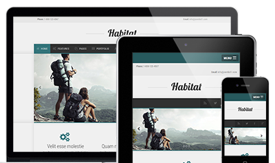
Habitat
Professional Bootstrap Template
Habitats clean lines and stylish design will give your site the perfect platform to stand out from the crowd. In modern web design content is everything and our Habitat template puts its focus on just that.
| Folder/File | Description |
| /assets/css | Contains all the CSS files for your template |
| /assets/css/animate.css | CSS animations - http://daneden.github.io/animate.css/ |
| /assets/css/bootstrap.css | Bootstrap front-end framework - http://getbootstrap.com |
| /assets/css/fontawesome.css | Font Awesome - Scalable vector fonts - http://fortawesome.github.io/Font-Awesome/ |
| /assets/css/nexus.css | Main template stylesheet |
| /assets/css/responsive.css | Responsive template stylesheet |
| /assets/fonts | Template fonts |
| /assets/fonts/*.svg | Font files for legacy iOS |
| /assets/fonts/*.woff | Font files for modern browsers |
| /assets/fonts/*.eot | Font files for Internet Explorer |
| /assets/fonts/*.ttf | Font files for Safari, Android, iOS |
| /assets/img | Template images |
| /assets/js/bootstrap.min.js | Minified jQuery Javascript library |
| /assets/js/jquery.isotope.js | Isotope JS - Filter and sort layouts - used in portfolio |
| /assets/js/jquery.min.js | Minified jQuery Javascript library |
| /assets/js/jquery.slicknav.js | Responsive mobile menu plugin - http://slicknav.com/ |
| /assets/js/jquery.sticky.js | Sticky Div - used for header area of your template |
| /assets/js/modernizr.custom.js | Modernizr JavaScript library - http://modernizr.com/ |
| /assets/js/scripts.js | Template Javascript adjustment and activation |
| /assets/less | Template LESS files |
| /assets/less/bootstap | Bootstrap LESS files |
| /assets/less/font-awesome | Font Awesome LESS files |
| /assets/less/variables.less | Template and Bootstrap LESS variables |
| /*.html | Template pages |
To better understand the structure of your template we have clearly commented all HTML. You will find each pages to be commented in to 3 main sections, header, footer and content. For most of your page you will find both the header section and the footer section to remain the same.
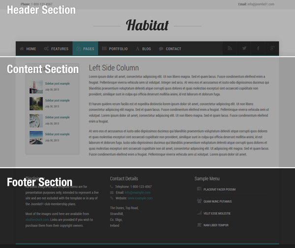
<!-- === BEGIN HEADER === -->
...
<!-- === END HEADER === -->
This sections starts from the very beginning of each page and includes all content common to each of your pages. The header section will include the following..
The content section contain your main content for each of your pages and will be where the bulk of your changes will be made.
<!-- === BEGIN CONTENT === -->
...
<!-- === END CONTENT === -->
The footer section contains the end of your HTML document. Similar to the header section, this section will most likely remain the same across all your pages, containing all the common elements in the foooter right down to the closing </html>.
<!-- === BEGIN FOOTER === -->
...
<!-- === END FOOTER === -->
The footer section will contain the following:
The following CSS files are loaded with your template in this order:
CSS for Bootsrap front-end framework
Animations stylesheet used for on scroll animations
Scalable vector icons for Bootstrap.
The main template stylesheet. This is where you will find the bulk of your template CSS.
Stylesheet for responsive layout. All CSS in this file is placed within media queries applied to particular devices and screen sizes.
Any custom CSS you wish to apply to your template can be added to this CSS files. This is the last CSS file to be loaded.
A utility class is a class that defines a set of methods that perform common, often re-used functions. Your template includes a number of helpful utility classes to help style your content.
The following shows how you can use a utilty class with a H2 heading. In this example we will be adding 40px bottom padding to the heading.
<h2 class="padding-bottom-40">
    A Sample Heading
</h2>
| Class | CSS Property |
|---|---|
| padding-top-0 | padding-top: 0px; |
| padding-top-5 | padding-top: 5px; |
| padding-top-10 | padding-top: 10px; |
| padding-top-15 | padding-top: 15px; |
| padding-top-20 | padding-top: 20px; |
| padding-top-30 | padding-top: 30px; |
| padding-top-40 | padding-top: 40px; |
| padding-top-60 | padding-top: 60px; |
| padding-bottom-0 | padding-bottom: 0px; |
| padding-bottom-5 | padding-bottom: 5px; |
| padding-bottom-10 | padding-bottom: 10px; |
| padding-bottom-15 | padding-bottom: 15px; |
| padding-bottom-20 | padding-bottom: 20px; |
| padding-bottom-30 | padding-bottom: 30px; |
| padding-bottom-40 | padding-bottom: 40px; |
| padding-bottom-60 | padding-bottom: 60px; |
| padding-horiz-10 | padding: 0 10px; |
| padding-horiz-20 | padding: 0 20px; |
| padding-horiz-30 | padding: 0 30px; |
| padding-horiz-40 | padding: 0 40px; |
| padding-horiz-60 | padding: 0 60px; |
| padding-vert-10 | padding: 10px 0; |
| padding-vert-20 | padding: 20px 0; |
| padding-vert-30 | padding: 30px 0; |
| padding-vert-40 | padding: 40px 0; |
| padding-vert-60 | padding: 60px 0; |
| Class | CSS Property |
|---|---|
| margin-top-0 | margin-top: 0; |
| margin-top-5 | margin-top: 5; |
| margin-top-10 | margin-top: 10; |
| margin-top-15 | margin-top: 15; |
| margin-top-20 | margin-top: 20; |
| margin-top-30 | margin-top: 30; |
| margin-top-40 | margin-top: 40; |
| margin-top-60 | margin-top: 60; |
| margin-bottom-0 | margin-bottom: 0; |
| margin-bottom-5 | margin-bottom: 5; |
| margin-bottom-10 | margin-bottom: 10; |
| margin-bottom-15 | margin-bottom: 15; |
| margin-bottom-20 | margin-bottom: 20; |
| margin-bottom-30 | margin-bottom: 30; |
| margin-bottom-40 | margin-bottom: 40; |
| margin-bottom-60 | margin-bottom: 60; |
| margin-horiz-10 | margin: 0 10px; |
| margin-horiz-20 | margin: 0 20px; |
| margin-horiz-30 | margin: 0 30px; |
| margin-horiz-40 | margin: 0 40px; |
| margin-horiz-60 | margin: 0 60px; |
| margin-vert-10 | margin: 10px 0; |
| margin-vert-20 | margin: 20px 0; |
| margin-vert-30 | margin: 30px 0; |
| margin-vert-40 | margin: 40px 0; |
| margin-vert-60 | margin: 60px 0; |
| Class | CSS Property | Color |
|---|---|---|
| color-default | color: #313131; | |
| color-primary | color: #33747a; | |
| color-red | color: #8b2626 | |
| color-blue | color: #43668c; | |
| color-green | color: #649f2b; |
| Class | CSS Property | Color |
|---|---|---|
| color-aqua | color: #86b998; | |
| color-yellow | color: #d0b426; | |
| color-brown | color: #6f6f55; | |
| color-violet | color: #8270a4; | |
| color-orange | color: #ae6926; |
All images used on the demo of this template are available free to download from the excellent http://unsplash.com/
Thank you for purchasing and we hope you enjoy your template!