- By: Anariel Design
- Email: info@anarieldesign.com

Thank you for downloading Freebix - free, fully responsive HTML site template.
This template is HTML/CSS Responsive Template. It is compatible with all modern Browsers, Smartphones and Tablet's. It is based on 960 grid and elegantly scales down to downsized browser windows, tablets, mobile phones (in landscape and portrait)
Freebix folder contains:
All content is within div named container /*div class="container"/*. With this your layout stayed centered on site.
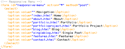
Template contains "Main Menu" and "Responsive Menu" - for mobile and tablet's


This part is responsible for prettyPhoto : 
Here is one example, open blog.html file and find this lines:

Inside href you need to put link to your bigger image that u want to show inside lightbox.

You just need to save your logo as a .png file in your images folder and to put it inside img src="images/logo.png" part of the code.
CSS Folder contains 4 CSS files:
The styles mentioned above are essential files, don`t remove them from your html files:

In screen.css all codes are well sorted for each part of the html structure. All you need to do in order to customize your website is to find corresponding id or class in the markup and to find its style in CSS file. For example:
HTML:

CSS:

If you need some help with css part or if you don`t know how to use and change it you can visit w3School: http://www.w3schools.com where you will find great tutorials and examples for CSS and also for the HTML, JAVA, PHP...
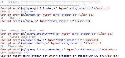
Js scripts are placed at the very bottom of the page in order to allow a browser first to load content and afterwards – javascript elements.
Like this :

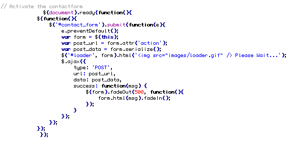
"process.php" file is important for the Contact Page / contact form

inside $toemail = 'test@youremail.com' you need to put your email adress so that people can contact you

Photos used for live preview are from markjsebastian. They aren't included inside of the download file.